2025 Public Domain Art Gallery
[ ]I'm developing an appreciation for paintings[1].
I'm not so keyed in that I really have an understanding or attachment to the core "meaning" of any given artwork, but I've found myself more drawn to interesting colors, textures, and artifacts of greater-than-average size. It's a very uncomplicated "child giggles at jingling keys" level of art appreciation. I have fun with it.
So, I subscribed to a rotating feed of pretty famous public domain artwork early in the year, and now near the end of the year I'd like to share some of my favorites.
I think having the space to write a tiny bit about what "caught" me for each of these pieces will be fun. I'm well aware none of this commentary is insightful or instructive. That is not its purpose. I just hope anyone reading this has their experience with these pieces enriched by getting to share them with someone (me!)

Work: Effet de brume, Honfleur
Artist: Félix Vallotton
I love the surreal, warping feeling of the composition and how much everything smudges and blends together. There's a cool sense of motion to the grass and trees and everything feels off kilter. The greens and yellows are vibrant and somehow amplify the dismal gray mist. It feels like one of those transient spaces that stories use to transport characters between "reality" and the "other world."
._Allegro.jpeg)
Work: Sonata No. 6 (Sonata of the Stars). Allegro
Artist: Mikalojus Konstantinas Čiurlionis
What an eye-catch! It's all yellows and browns but it feels so vibrant. Maybe it's the golden quality to the yellow tones, but something reminds me of retro-futuristic, art-deco things: think Bioshock or the covers of some of Asimov's books. It also reminds me of some of Vasily Kafanov's work
_-_Museum_Boijmans_Van_Beuningen.jpg)
Work: Boomstam, omgeven door bloemen en door vlinders en andere dieren
Artist: Rachel Ruysch
I see it so clearly. In an alternate universe, this is the cover of a deathcore concept album. It'd be titled We Come From Rot and it would be bleak as hell until it concludes with this shoegazey drone track that just puts you in a trance. Sometimes my favorite thing about artwork is where it sends my imagination! For some reason, this painting makes me think of Saturn Devouring His Son.

Work: House at Auvers
Artist: Vincent Van Gogh
I feel like I see this house in so many Seattle neighborhoods. Just make the trees taller and wham! I'm right at home. It's so cool to see the contrast with the very coarse paint strokes and how they come together to make cohesive forms. This is one of those paintings I should not see in person because I will want to put my grubby little mitts all over it and commit a culture crime. It looks like it would have a very neat texture feel.

Work: Flower still life
Artist: Adolphe Monticelli
This would be the artwork accompanying the lyric sheet insert of the aforementioned deathcore album. It's all the floral bleakness of Boomstam with all the abstract-paint-blobs-miraculously-look-like-something of House at Auvers. Beautiful.
_-_1905_-_6,_Varsuva.jpg)
Work: Creation of the World
Artist: Mikalojus Konstantinas Čiurlionis
I'm going to ignore the obvious that this would make for another killer album cover. Instead... wow! that is such a rich palette of blues and a really effective use of a monochromatic colors to give a sense of light and depth. Like swimming through a deep underwater tunnel. The texture of the brush strokes makes me think of underwater eroded rock surfaces: unexpectedly smooth but still gritty. And I'll note this is the second Čiurlionis work on this list. And they're so different!
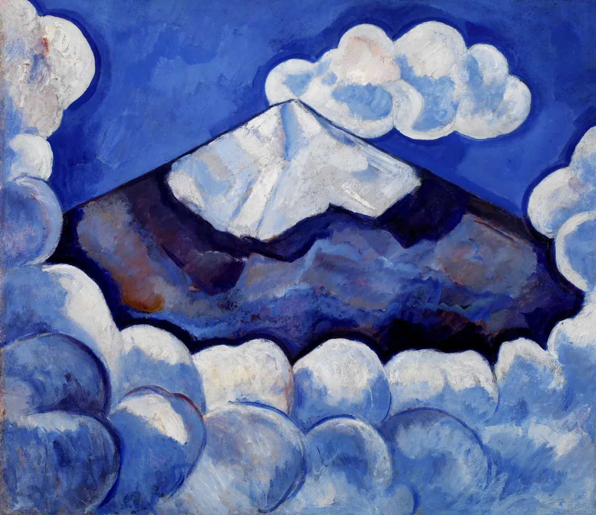
Work: Popocatepetl, Spirited Morning-- Mexico
Artist: Marsden Hartley
Something about the shadows between each layer and the relatively similar sizes of the layers makes me think of set pieces in some kind of puppet theatre. Like Punch and Judy or shadow puppets or something. The colors are great too! A not-quite-monochromatic blue palette that makes the clouds look really soft. Check out the clouds in the bottom right corner. For some reason, this painting above others really brings me back to the style of Braid.
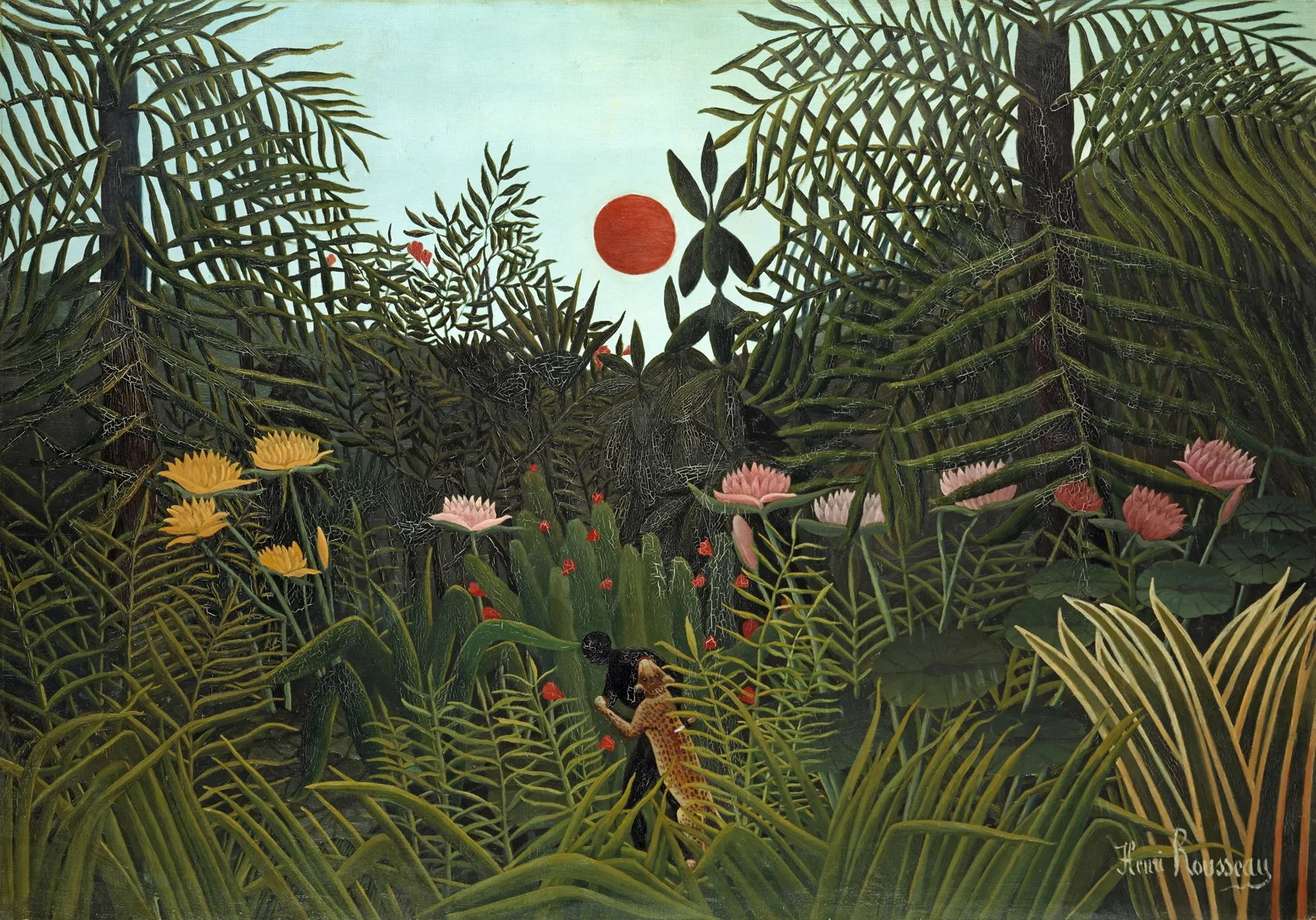
Work: Jungle With Setting Sun
Artist: Henri Rousseau
I'm not huge on this one but I think the contrast works exceptionally well. Everything is in this soft green color, except the sun, center frame drawing all the attention. There's something about the sun being that size and that low to the horizon that makes this piece feel eerie to me, too. It's too... small? It certainly seems off to me. And I like that! On a side note, I really struggled to find a good source archive of this work online. A lot of the works I've shared here were easy enough to find on Wikimedia Commons, but after much googling I couldn't find any sites that weren't just selling prints of this work. Nothing was archived on the Internet Archive either. I found this surprising.

Work: The Bonaventure Pine
Artist: Paul Signac
Oh me, oh my, it's pointillism baby! And what-a-pointillism if I do so say so myself. I love the way the light works in this piece. The far background is full of soft, radiating light rays but the tree is still mostly in shadow. To me, it reads as a sunrise, but the tree is blocking the sun and becoming the focal point. There's apparently a lot of impressionist art about sunrises. I bet there's some significance in this impressionist piece plopping a tree right in the middle of that sunrise and upstaging it. How bold! How brash!
That's all! I hope you enjoyed my curated little slice of pretty-famous-public-domain-art.
Footnotes
[1] Edit (Dec 19, 2025): While thinking about this post recently, it occurred to me that I think my appreciation for paintings sprung from Jermaine the Dog. It's less the paintings themselves and more what they represent in Jermaine's character arc: changing from a daddy's boy ascetic to a wiser, self-driven person (dog?). His character flaws feel close to some of my own and it endeared me to the role painting plays in his story. It's funny the sorts of things that influence us!